Designing a Kick-Ass Mobile Website
by Mac McLaurin, Co-founder, Director of Creative and Strategy
Sept 2
So why (if they feel so right and are so good for brands) are kick-ass mobile sites so rare?
Two reasons come to mind:
First, most Web designers (and advertising agencies and Web design firms) today are hardwired to create big beautiful desktop sites first, often relegating the mobile version of the site to an after-thought. They’re not bad people, they just haven’t caught up to what’s going on in the world of mobile. A travesty considering 56 percent of consumer traffic to the leading US websites is now from mobile devices.
Secondly, in my experience, designers and creators believe that the average consumer is more patient and accommodating than he really is. News flash: nobody wants to wait for your site to load — no matter how killer you think it is. Nobody. In fact, 53% of people will leave a mobile site that takes more than 3 seconds to load. And 85% of customers will not forgive a bad mobile experience.
Which brings me to why I’ve written this article.
One of our websites was recently awarded Best Mobile Website, by the Web Marketing Association, which got me thinking. How exactly did we do it? And how could I help others to do the same? After retracing the path that got us to this point, I’ve included below the five components of the process that led us (and will lead you) to creating a high-performing, award-winning, kick-ass mobile site.

1. Have a strong campaign idea
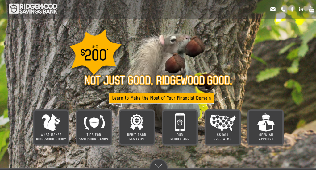
First and foremost, have a great marketing idea. Something you really love and that you’re confident will lead to an engaging and compelling site. I feel obligated to mention here that our client for this example, Ridgewood Savings Bank, has consistently allowed us to do great work. So having the right client helps. In this case, our campaign idea included Switch the Squirrel, a lively animated character who served as a fun way to communicate the reasons to bank with Ridgewood. The Ridgewood Good campaign was as an easy through line for our mobile design and the ad campaign won multiple awards before also earning Best Mobile Website.
2. Design your mobile website to act as “the closer”
From the beginning, we were determined to make sure that every aspect of our marketing campaign worked together as a cohesive sales package with our mobile website serving as the closer: a friendly and skillful virtual member of the sales team whose job it was to “close the deal.” All advertising (TV, radio, online banners, posters, newspaper ads, etc.) was designed to drive potential customers to our website, which in turn provided information, answers and entertainment — everything we could do to engage and convince a potential customer. For instance, since we knew the cumbersome process of switching banks was a barrier to entry for many new checking customers, we included a section called “Tips for Switching Banks,” as a way to help close the deal. This, along with an offer and details on Ridgewood’s competitive products and benefits helped secure new accounts and a healthy ROI for the site.

3. Design the mobile version of your site first
Knowing the importance of smart phones with our target (Millennials and first-time checking customers), we decided early on that our mobile experience had to be flawless. This changed our initial design canvas from the big horizontal computer-screen rectangle we generally start with, to the much smaller, vertically-oriented cell phone screen. In today’s world, mobile-first is the new best practice. And, while designing in this way can seem counter intuitive at first (especially in client presentations, where everyone is used to seeing big-screen ideas), it’s essential to coming up with a kick-ass mobile design. Start with the mobile version. It’ll save you a lot of headaches, and lead to better designs, quicker, in the long run.
4. Let UX lead you to the Promised Land
Google says 61% of people that have trouble accessing a mobile site do not return and that 40% of those will visit a competitor’s site instead. I’m surprised it’s not 99% on both counts. For me, mobile frustration ranks a close second to road rage. To avoid it, we as developers must be ready to “kill our babies” (i.e. completely throw out initial designs and ideas) if they don’t translate to a fast and fabulous mobile experience. That doesn’t mean that designers should take a backseat to developers, but it does mean that the cycle of designing, testing and optimizing must be included in the creative mantra for all parties.
For the Ridgewood Good website, our initial design, while aesthetically pleasing, was clumsy and wound up looking nothing like our final, optimized design. The problem was, while we knew what we wanted the site to convey, it took a few iterations to settle on how it would be conveyed. Our original design followed a scroll-able format with lots of touch-and-expand sections. In our UX tests however, we found that expandable sections caused people to leave the site. They were interested in the information, but they wanted the site to be quicker and more “swipe friendly,” so they could skip over some parts if they wished. This led to numerous design improvements.
5. Provide visual rewards to the user
To nudge the user along our site we also added a number of fun, little animated GIFs. GIFs are a good way to add eye candy to a site without slowing down load times. In this case we used our character, Switch the Squirrel, as well as a series of simple illustrations (squirrels, acorns, etc.) to engage users and reward them for moving through the site. This feature, which we’ve used with great success in other sites, helped us increase page views and time spent on the site.
So there you have it, my thoughts on how to create a website that kicks ass on mobile. I hope this article helps to inspire mobile greatness in your next website.
One more piece of inspiration…
I highly recommend an article written by Rebecca Ussai Henderson. In the post she interviews Disney movie animator, Dan Boyarski, who says, “You are responsible for directing each element’s entrance, performance, and exit,” an amazing thought for a web designer to incorporate. Rebecca then goes on to describe the principles of UX and how they relate to the brilliant work of Disney animators. If you liked my article, you’ll love hers.
About The Author: Mac McLaurin is a co-founder of Fifteen Degrees Marketing & Digital, a Manhattan-based advertising agency that specializes in combining the power of emotional branding with the precision of digital marketing. You can connect with him on Twitter, Facebook, LinkedIn, Instagram and Medium.