Political Logorama
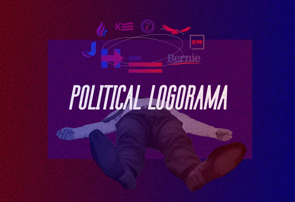
A discussion on presidential logos and their importance to a campaign.
by Fionna Duffy, Art Director, 15º
Oct 1
With the election mere days away and our heads swimming with strange facts, policies and scandals, it may seem frivolous to step back and take a look at Donald Trump and Hillary Clinton’s logos. Yet a candidate’s logo has come to bear more weight than it did in previous years. In 2016, the unveiling of a logo has evolved into something of a ritual, allowing candidates to gain a slight edge over a saturated field of competition and going so far as to define a presidential hopeful’s brand. In an era where voters and volunteers are especially interested in the design of the logos emblazoned across their American Apparel Classic Tees, faced with an unattractive campaign logo, some eager voters have taken to overhauling their candidate’s branding and apparel to better customize everything to fit their demographic’s aesthetics.
Explains Ali Elikin in Bloomberg, never before has a candidate’s logo played such an important role in an election:
The increased attention to branding makes sense in an era when candidates need attention-grabbing, shareable social media profile pictures for themselves and their supporters, easily recognizable images for browser-tab “favicons,” and designs to apply to a wide range of merchandise.
How did this happen? Up until recently, campaign logos tended towards the generic, using a simple formula of red and blue (not only patriotic, but bipartisan and just plain nice to look at) added to a mundane combination of stars, stripes, eagles, and little to no personality. Sure, occasionally a candidate would throw in some punctuation, and the wild serif fonts of the 70s were fun, but generally speaking, there was really nothing revealed that Americans hadn’t seen the election year before.
And then there was Obama.
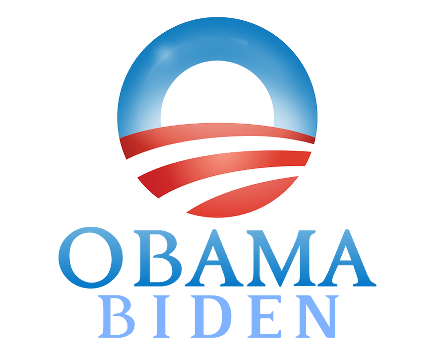
There’s no denying that President Barack Obama’s 2008 campaign logo ushered in a wave of design that hadn’t been seen since the 60s. Even designers who aren’t fans speak of it in awed tones:
“Whatever you say about [Obama’s] mark — [it’s] maybe a tiny bit cheesy for me — it has been so successful and so impactful. It had a huge impact on the campaign,” [Sagi] Haviv said. “It was extremely well-used throughout. I think that in some way, it changed the course of history in terms of design for campaigns, and everybody is now trying to achieve the same thing.”
Haviv, a partner and designer for the New York firm Chermayeff & Geismar & Haviv, has created logos for the Library of Congress, Armani Exchange, and Harvard University Press, among other clients. Noticing a trend towards corporate iconography not commonly seen in politics before 2016, he remarks on a shift in the branding of a candidate–“even using that word, ‘branding,’ of the candidates”–that has led to a more commercialized approach to the campaigns we see and hear today.
Interestingly enough, an interview with Sol Sender of VSA Projects, the lead designer of Obama’s logo, revealed that the designers had never done a campaign logo before, though they had previous experience designing corporate logos. The team intended to capture a feeling of hope and progress without making a complicated design. Using the “O”–a soft, inclusive shape–in a friendly tone of blue, combined with red stripes that allude to a road leading inwards, pulls the viewer into the logo and its surrounding branding. It’s an artistic, yet highly strategic manipulation that works well and looks somehow both modern and nostalgic.
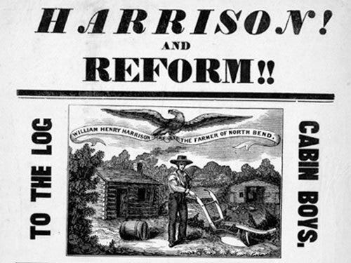
Depicted as a rough farmer from humble beginnings, Harrison was actually born in a mansion on a Virginia plantation and lived quite comfortably at the time of his nomination. Still, the use of log cabin symbology combined with depictions of soldiers and a jug of hard cider shrewdly merged his hard-earned reputation as a military hero with a false rags-to-riches backstory and made him the original “guy you want to have a beer with.” Deeming Harrison “The Hero of Tippecanoe” (a battle from the War of 1812 in which Harrison led American forces) as well as introducing the slogan “Tippecanoe and Tyler Too,” (referring to Harrison’s running mate, John Tyler) ensured a win for the Whigs by a 6 percent margin in the popular vote and 80 percent of the electoral votes.
Since then, presidential hopefuls have always featured slogans with a design in their campaigns, to varying degrees of success. Jessie Guy-Ryan covers quite a few hilarious examples in her article for Atlas Obscura, A History of Embarrassing Presidential Campaign Logos, but suffice it to say that strategy-wise, campaigns have not changed drastically in the past two-hundred-twenty-odd years:
The 1852 election saw Franklin Pierce promising America, “We Polk-ed You in ’44. We Shall Pierce You in ‘52.” Pierce, considered a longshot for the presidency, hoped that by associating himself with James Knox Polk, another dark horse who ended up a very popular president, voters would be convinced that another vote for the underdog would lead to another prosperous four years. Surprisingly, the weirdly aggressive slogan worked.
Which brings us back to modern day. Positioning himself as an underdog, Republican Nominee Donald Trump has aligned himself strongly with Former President and fellow Washington Outsider Ronald Reagan, subtracting the “Let’s” and adding an exclamation mark to Reagan’s famous “Let’s Make America Great Again”. This removes the sense of community involvement from the phrase and turns the statement into more of an imperative than a mere suggestion, promoting Trump’s image of strength and power.
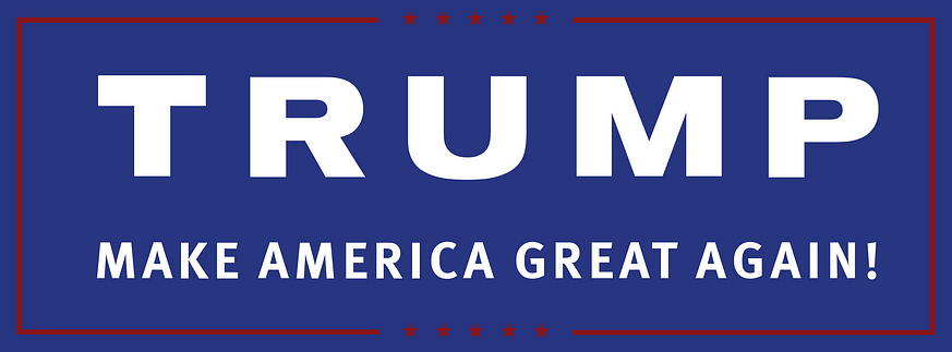
It’s inelegant from an visual standpoint, but it does follow one essential rule: incumbents generally use serif fonts, while challengers use sans serifs. This logo is a deeper blue than usual, closer to the richer blue of 90s logos and perhaps intended to recall military navy, which was used appropriately in former candidate John McCain’s logo. Unfortunately, using a color like this renders the red stars above and below the type invisible; later alternates of this logo used white stars instead.
Then there’s the famous ticket logo:
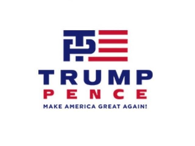
While today’s logos are preferably initial-based to allow for social media sizing (see former candidate Martin O’Malley’s fantastic logo), this one doesn’t quite work, and one can only assume it was supposed to look like a Tommy-Hilfiger-inspired monogram. Besides the fact that the flag’s bars don’t quite match the weight of the lettering, conceptually it all just seems lazily thrown in (unlike the torch in former fellow Republican hopeful Rand Paul’s logo). For these reasons and a few others, it was universally panned on Trump’s home turf, Twitter:
A day later, the Trump-Pence campaign revealed a revised logo, removing the suggestive initials and flag design and leaving a standalone wordmark, and the controversy was over. Still, one can’t help but notice that Pence’s name is much smaller than Trump’s: according to Time Magazine’s Chris Wilson, who compares of the ticket name sizes of the past three cycles, this would lend itself to Trump’s claim that he alone can fix the country.
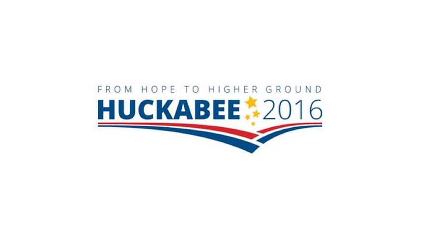
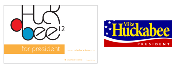
A quick mention of fellow Republican Candidate Mike Huckabee, not for his logo design but for his tagline, which reads “From Hope to Higher Ground”. Not only is this an obvious snub to Obama, but it’s a plug of his 2007 book of the same name and a clever reference to his hometown of Hope, Arkansas. Layers!
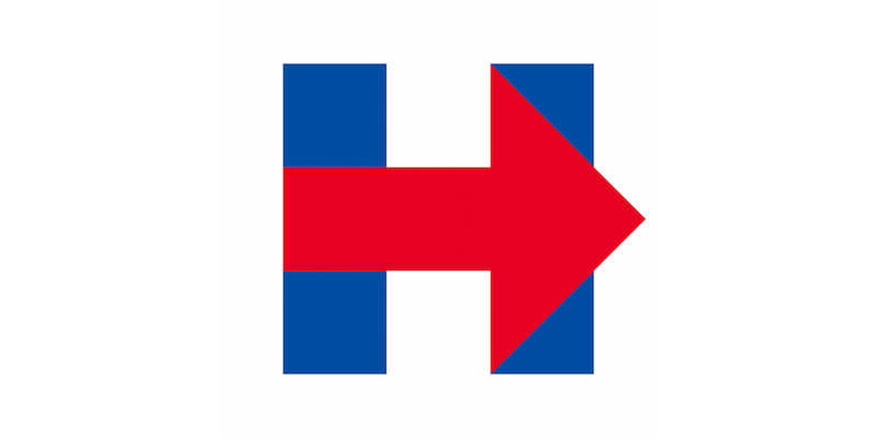
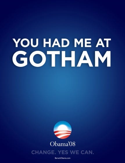
Despite being co-designed by Pentagram’s Michael Bierut as a volunteer contribution to the campaign, Secretary of State and Democratic Nominee Hillary’s Clinton logo hasn’t been the runaway hit one would expect. Compared to everything from the FedEx logo to the Cuban flag, it has also inspired a widget that lets anyone make their own Clinton-like logo, a font named “Hillary Bold” and a load of controversy. It clearly borrows from Obama’s icon, even looking a bit like the Gotham font that Obama’s campaign later used, yet doesn’t have quite the same impact as its predecessor. While Kate Tallent, Principal and Creative Director of KTD Creative, called it “so unrefined it’s freshman design-student work,” Haviv stresses that it’s not actually necessary that a logo be liked, especially right after people see it for the first time.
Sometimes it’s kind of awkward, or maybe kind of rubs you the wrong way the first second you see it […] That’s what we’re looking for, something kind of unusual, distinctive.
Scott Thomas, the design director for Barack Obama’s 2008 presidential campaign, thinks it’s saying nothing at all: “It’s just a red arrow moving to the right.” Yet this in itself speaks volumes, as it could be implying that Clinton intends to represent everyone, not just Democrats, or that she plans to move the country’s politics further to the right. Currently, the logo has been put to good use on her website, pointing visitors toward volunteering and fundraising links.
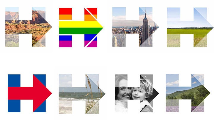
Of course, the “H” logo will evolve over the course of the presidential campaign, just as the “O” did, and looks much better when used as a customizable frame, as is it here:
If Trump’s ticket logo focused less on the nation’s potential VP, Clinton’s does a better job at equalizing the candidates:
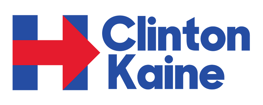
From this logo, says Chris Wilson, “Clinton, we’re told, is a builder of coalitions.” Here we see an unadorned Geometric sans typeface called Unity, a customization of Sharp Sans by Lucas Sharp, that calls to mind President Obama’s later use of Gotham with its large x-height and regularized letter widths. Perhaps because of the persistent accusation that Hillary needs to strive for likability, the font uses lowercase, which as a rule strikes a friendly, approachable tone. Compare this with Trump’s logo, which follows the commanding, authoritative all-caps of Obama 2008.
Of course, no campaign could be won on a mere logo. But political veterans maintain that a great logo can have a greater impact on a campaign than ever before. Says Patrick Ruffini, a GOP digital strategist who worked on the Bush-Cheney 2004 reelection campaign,
A strong brand identity can communicate your message and your values to a potential voter with a single glance, without you having to buy an ad or even say a single word.
Social media allows everyone to be an armchair critic, as Bierut bemoaned in 2013, calling the criticism a “spectator sport [that] anyone can play,” but it also means that the reaction to a new logo or brand can go more viral than the logo itself. In less than a week after Clinton unveiled hers, a post featuring a “five-minute” redesign of Clinton’s mark reached more than 1.1. million viewers, which is really only good news for Clinton’s brand awareness. To downplay a logo’s influence is foolish, as smart politicians pour donations and effort into making their campaigns as memorable and as “buzzworthy” as possible–any discussion is good discussion if it leads to a vote.
As Clinton spokesman Josh Schwerin coyly puts it, “We’ll leave it to others to read too far into our logo.”